Hustling Mobile World Congress when you’re a startup

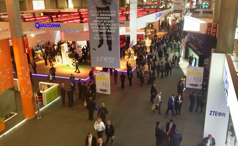
Mobile World Congress is the largest annual gathering in Barcelona for everyone who’s anyone in the mobile ecosystem. At the last minute I decided to go to do some market research / customer development for Ansr.io. Here’s a braindump of things I learnt.

MWC

Prices go up for MWC

Hotel’s are 3x as expensive during the conference week. EasyJet bumps up their prices 2-3 times (if note more), likely the same with other airlines. The conference ticket itself is €690!

I was super late for planning my trip so had to work around those criminal numbers.

There are always plenty of competitions happening before the event that give out free tickets. Participate. Find the companies who have a booth – they get a pack of tickets for free so work your connections (thank you, Open Signal!).

Flying in a day earlier saved me megabucks on EasyJet. Enough to pay for a night and food, see a little bit of the city and get some work done as well.

Airbnb is your friend when it comes to sleeping (or try Startupstay). I found a superbly located room for $47/night which was 4x cheaper than an OK hotel next door.

Look outside MWC

For early stage products and starups MWC might not be the right event but they should still go to Barcelona during MWC. There are so many events happening outside, on the fringes of MWC – pitching contests, talks, networking parties – that you can get away with paying nothing (free beer included).

Some quiet courtyard in old Barcelona

Borrowing advice from Danielle Morrill’s excellent “How to Hustle SXSW for Fun & Profit“:

Prepping your calendar – Don’t fucking do it. /…/ Instead, put EVERYTHING on your calendar so you know what ALL your options are, RSVP for EVERYTHING /…/ If there is something you absolutely have to be at, like an event your company is hosting/sponsoring then make it a different color.

Heroes of the Mobile Fringe was great at feeding me events outside MWC. Mobile Premier Awards was great for getting access to founders of up and coming mobile apps/startups.

I only spent one day at the conference, focused on one hall (app development) and picked rest of the events from those happening outside.

Practicalities

Transport in town – Barcelona’s public transport is excellent, metro is fast and cheap (€2 per ride). Getting a taxi to/from MWC isn’t super expensive but jams are boring, take the train/metro instead.

Wifi – don’t rely on it. If you plan on pitching with live demo (either on stage or just to people you meet), then make sure you have solid 3G.

Roaming fees – they are a killer. Get a local SIM or be prepared to pay up. Find an app that does offline maps (like for Android). Looks like Fogg might the savior next year in this.

Battery life – if you’re relying heavily on mobile demos and use it for email/maps/Twitter then get a mobile charging solution. In my experience you can leave your laptop to your hotel, no point weighing you down.

Show, don’t tell – I made the mistake of not having a few screenshots of how Ansr.io powered mobile surveys can be distributed in the beginning. Next year I’ll have them set up in a tablet when hitting WMC stands.

Iterate your pitch – I very quickly figured out that “Surveymonkey for mobile” was the one for us. Boring but it works.

Business cards – Bring more than you think you’ll need. Note to self: remove QR code from card, add company tagline instead. A pen to scribble notes on business cards is a good idea.

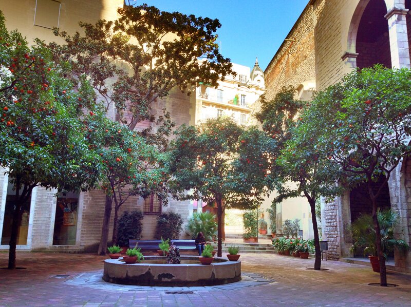
Don’t forget to enjoy the tapas, Barcelona is a beautiful city.

Mobile ads – it’s the late 90s all over again

Banner advertisement in the late 90s and early 00s was mostly an ugly affair. Never mind the banners that were designed to disrupt your browsing by visually and verbally screaming something at you. What happened once you clicked the ad was equally appalling.

Mobile ad world today is very similar to those sad times 10+ years ago. Exhibit A (as seen on iPhone 4S):

Skype’s mobile banner ad

I’m normally banner blind but as a former Skype employee this one caught my attention.

You can just make out that it’s Skype, webcam and (probably) shopping. Fuzzy as belly button fluff with no less than 5 competing visual elements – the webcam, discount button, the main headline, Skype logo and green call to action button.

As a friend and mobile/web developer friend put it: “2x upscaling never works”.

The banner links through to Skype’s holiday gift guide – yes, a full-blown web page, no mobile optimized version for you, ma’am. I wasn’t feeling masochistic enough to try the shopping experience but wouldn’t expect a mobile-friendly experience.

Skype landing page

All this reminds me of those annoying banner ads back in 2000 that promised something good and then linked to the site homepage that had no mention of said promotion. Or maybe you got to a proper landing page but it was impossible to purchase whatever was being advertised.

I bet the conversion from ad viewer to someone who taps on the banner to someone who takes desired action is equally bad or even worse on a mobile device.

How to make it better?

Get the basics right and you’re much closer to seeing some return of investment on your ad dollars.

  • Creative and design – you have very little real estate, distill the message and visuals down to the minimum. Learn from Apple – simplicity and clarity wins.
  • Design and serve – don’t serve default resolution image to retina devices. It’ll look ugly as above and you’ll see lower click throughs and waste money. If the ad network you’re using doesn’t support serving different ads based on user device then don’t use them. Alternatively don’t use them for retina device visitors.
  • Device specific experience – don’t send mobile visitors to your main website. Smartphones are capable enough in displaying your site but this does not mean that it’s good enough. Build a simple mobile-friendly page and tailor the shopping experience well. It’s an investment in the beginning but if you don’t do this then you’re just wasting money on ad dollars.

Not exactly rocket science. All the more puzzling that big companies like Skype still get it wrong. The smart guys are ignoring the banner ads anyway and are building creative, engaging content-based marketing campaigns.

Fake it till you make it: features Ansr.io lacks (for now)

Bike without a saddle

Reading Paul Kortman’s The problem with a Lean Startup: the Minimum Viable Product made me realized that Ansr.io is similarly guilty of pushing its early customers off the cliff (figuratively speaking).

The basics of the lean startup philosophy are to get user feedback, do user testing, and discover if people are willing to use (and pay for) the product you are creating both before and throughout the creation process.

Paul has used minimum viable product (or MVP) methodology when building ThingShare and doesn’t feel good about it. According to lean startup school of thought you try to avoid building features and functionality before there’s an established need for it by the customers. The results is a user experience where the features are not there yet.

So our earliest adopters, the people who trusted us, we pushed off a cliff in the name of Lean Startup. What am I supposed to tell them… “Sorry it was an MVP?”

At Ansr.io we have not been that rigorous with minimum viable product approach for mainly one big reason. We had a mobile survey product already built before we launched Ansr.io. It was gradually built over 2 years as an in-house tool for On Device Research to do mobile market research for corporate customers.

Our challenge was to break the software apart, simplify and streamline the user experience, hide a lot of power user features, to be easy enough to use for customers who want to create simple mobile-proof surveys.

In the spirit of “release early, release often” we’ve taken our fair share of shortcuts which can be confusing or annoying to the prospective and existing customers.

Fake it till you make it – 3rd party integrations

That Mailchimp and Salesforce integration we tout on our homepage? Nope, it doesn’t exist yet. It was put there as a test to see if we start getting “Hi, I want to do this Salesforce integration you promise, how does it work?” as a signal that it’s important.

3rd party integration

In hindsight it should have probably been a different test with page of various 3rd party connections and better measurable way (people clicking on “tell me more about connecting with service X”). In its current form it’s been a failed experiment.

For the record, we’re working on minimum viable API but for the first integration taking a white glove approach – no development before we’ve taken a handful of customers through the various steps manually to learn about customer wants and needs, friction points etc. Only after this is done will we (and our partner) go ahead with actual development.

No, you can’t pay us (easily)

Ansr.io is largely a free service and even for the stuff that we charge (sending surveys out via SMS or to our panel of respondents if you want to do more traditional market research) there’s no obvious easy way to pay for.

Instead of spending X amount of days on building good enough payment flow we’ve focused on the core experience (creating and spreading surveys) and taken care of payments manually. Leaving it to the customer to figure out that they need to get in touch to up the credit on their account is not ideal but seemed like the right trade off at this stage (roughly 1,5 month after Ansr.io launch).

Related articles:

User Experience is Not a Feature
7 reasons mobile surveys beat their web-based brothers
Turning fire hose into bags (and improving them with surveys)

Photo:

Inbound Marketing UK 2012 – saved by the keynotes

It’s been a while that I went to a proper old school conference with proper old school scheduling, event space, keynote followed by non-keynote speakers followed by panel followed by breakout groups followed by keynote in a proper conference place. Proper 9 to 5 thing too.

The content you create has to be the best in the industry. If it isn’t you won’t win the attention of your prospects. – Mike Volpe, Hubspot

Lousy tshirt

Inbound Marketing UK 2012 certainly had its highlights (more on that later) but also stuff that should change or improve to become the best in the industry.

  • Energy – 4 main speakers had it, rest of the event lacked it. And I thoughts my fellow Estonians were reserved.
  • Breakout sessions – maybe it was my bad luck but these were let down. No fresh insight, not cutting edge examples, test results, tools. Could be that the people and channels I follow give me the freshest on a daily basis anyway. For me #imuk12 could have been better without the breakout sessions.
  • Panel – I’m no fan of panels, they’re too polite, too soft, not hard hitting enough. There’s seldom debate and while the panel this time was above the average it didn’t hold my attention. Someone should do tweet velocity and sentiment analysis vs presentation…
  • No QA session with couple of the earlier speakers.
  • Understandable that Hubspot was a sponsor so plenty of mentioning of them but it sounded like there’s 0 competing software out there…

The highlights for me were definitely the main four speakers so nicely pimped on #imuk12 website. They inspired, gave some good tips, in particular forced to look at inbound marketing from totally different (sales) perspective.

inbound marketing heros 2012

Too bad Alex Balfoul, the Head of New Media of London 2012 Olympic Games had so little time, it’s quite amazing what they achieved with such a little team. The whole scale of the Olympic Games is mind boggling. Sadly – no QA session.

I have a bunch of notes and ideas jotted down, will sort through them and do a separate post a bit later.

Will I be going again next year? Probably not if it keeps the current format. I’ll miss couple of world class speakers, sure. All the up to date stuff is available from various great channels online, for example follow if you can keep up with their tweet-an-hour velocity of pumping out great content.

Mike Volpe, Daniel McLaren, Jenn Yorke and Bas Ellen

Oh, and of course the organizers should have used Ansr.io to create a mobile-friendly exit survey, push it to conference participants 5 minutes before closing to get fresh feedback and raw emotion by the time people were done with their commute home :)

Vostok Europe Gaz-14 Limousine wristwatch review

Having been born and lived the first 12 years of my life in the Soviet Union I’m a living testament of how everything from one’s childhood has a positive aura, no matter how bad the overall life actually was. Which is a long way of saying – I was rather looking forward to receiving the Vostok Europe Gaz-14 Limousine Chrono wristwatch for a review.*

Vostok Europe Gaz-14 Limousine wristwatch

Gaz-14, also known as Chaika (or seagull in Russian), was a car built for the higher echelons of the politbureau of the USSR. In Estonia it was a rare sight, I might have seen it once or twice during some parade. But all the kids knew – Chaika stood for something special, it meant old-ish important men in dark suits, military parades, power (however we understood it back then).

The Gaz-14 wristwatch rather nicely reflects those sentiments in its classic design and sharp black’n’red packaging. I might not be keen on the design of other Vostok Europe watches but the simple lines, stainless steel case and black face talk to me. If you want to go even simpler then pick the version without the chronograph as it does make for a somewhat busy design.

The chronograph has a nice little feature which is simply fun to watch – the sub-dial at 6 o’clock, which normally tracks seconds, jumps to action going back and forth denoting 1/20th second when stopped. And the large second hand does a nice little sweep around the dial when timer is reset. It’s a pretty good party trick as far as sub-200 Euro watches go.

Gaz-14 Limousine in bullet points

  • Solid stainless steel round case, 42 mm.
  • Japanese Miyota OS22 movement
  • 5 ATM water resistance
  • Tachymeter
  • 1/20 sec chronograph with retrograde demo, timing up to 59 min 59 sec
  • Genuine leather strap

The strap is my only niggle with the watch – it suits the watch well, matching the somewhat formal look of it nicely, but for my admittedly narrow wrists even the tightest fit was too loose. Annoying when cycling as the crown (or the buttons) start to hurt.

Vostok Europe Gaz-14 Limousine wristwatch backplate

If you were to forget the name of the watch you were wearing then simply turn it over, the screw on back plate has a modified car company GAZ logo and the serial number of your watch (3000 will be made altogether).

Vostok Europe is not the Vostok my father knew

Vostok Europe is a rather curious watch company – while the brand Vostok is Russian, VE is actually a Lithuanian company, building watches in Vilnius since 2004. Not the first city that pops to mind when talking about wristwatches. From what I can tell they don’t use Russian movements in their watches any longer and most of the marketing I found on their Facebook page targets younger, more active audience.

How much and where?

The price listed on VE website is 194 € but if you’re in the US then it’s probably easier to get one from Amazon for $242.50. The UK Amazon doesn’t carry the one with the black dial but has some other versions available.

Should you get it? If you like the design, want a smart dress watch that works in casual settings too then yes. The quality of this watch is top notch for the price.

Vostok Europe Gaz-14 Limousine

If you want a watch with real Russian history, the movement and all then keep searching but be prepared for a barrage of some seriously tacky design. I’m the keeper of a real Vostok from my father till my son is old enough to appreciate watches. I also own an old Russian Pobeda watch I inherited from my grandfather.

* Full disclosure: Vostok Europe sent me this watch free of charge to keep in return of this review. As always I write about products as I see and experience them, flaws and all.

The surfer I’ll never be

Massive Cloudbreak from the Volcom Fiji Pro 2012. Tune is

They say never say never but I’m pretty sure this time :)

WolframAplha analyses your Facebook profile/network

The “computational knowledge engine” WolframAlpha just rolled out a new Facebook report tool that looks at your FB profile, activities, network and spits out a rather interesting view of your Facebook-based life and friendships.

My Facebook friends network

Founder Stephen Wolfram posted a longer piece on insight that can be gained from the report. He also shares how to set it up (tip: go to WolframAlpha and type in “facebook report”).

Here’s how the ultimate ego-analysis looks like. The networks view was the most interesting part, clear clusters of friends emerge with lots of overlap in some, of course. Made me realize that I’ve added only very few non-Skype London/UK based friends to Facebook, looks like these interactions are happening mainly on Twitter.

WolframAlpha Facebook report

Names have been blurred out to protect the guilty.

Bank holiday travel in the UK – better stay home

Alternative headline for this post goes something like: “Things I learned from trying to get out of London with a car and a baby on a long weekend”.

Bournemouth sea and cliff view

Where to start… Thing is – we’ve been living in London for 8 months now but never somehow got out of the city. So when a long weekend (bank holiday aka extra free day) popped up I rented a car on a whim, booked a hotel at the last minute in Bournemouth, and looked forward to showing Kadri the countryside.

Queuing – it’s a national hobby here

We ended up having to wait in line pretty much everywhere – traffic, Peppa Pig World amusement park (in the end got 3 rides in 2.5 hours at the cost of £48 per two adults), cafe at the amusement park traffic, parking, traffic, traffic. Did I mention traffic?

Keep readin’ →

I cheated and brought my site bounce rate down from 80% to 12%

Bounce rate is the percentage of single-page visits to your website (according to Google Analytics). It can be an infuriating number to track if it’s constantly above 80% as it tells the site owner that they’re content is not engaging enough to keep visitors around.

Lazy cat is lazy. Not much engaged

I cheated and brought mine down from 80% to 12%. Here’s how:

My website bounce average has been 80% for quite some time now. Maybe that’s good enough for a blog-like site like this as a big portion of the traffic comes from Google and visitors either get an answer to whatever they were looking for or don’t (and go back to Google to look at alternatives).

Looking at the segment of visitors who do 1+ pageviews then the situation is quite good – average pageviews per visit is 3.7 (up from average 1.5) and time on site to 4:27 (up from 00:51 seconds).

Finding my site’s true bounce rate

Inspired by Gael Breton’s I tweaked the tracking code on my site with the following (full code example in the original post):

setTimeout('_gaq.push([\'_trackEvent\', \'NoBounce\', \'Over 5 seconds\'])',5000);

It tells Google Analytics that anyone who spends over 5 seconds on the page, even if they only look at one page and then leave, is not a real bounce. 5 seconds is long enough to read the headline, scan the top of the page and make a leave/stay decision.

The result? My site bounce rate plummeted from 80% to 12%.

Bounce rate change

Maybe 5 seconds is too short (I’m going to test with 10 or 15) but other than getting the timing right I can’t think of a downside to finding out the true bounce rate.

Combining this with other engagement metrics in Audience > Behavior menu in Google Analytics gives you a more accurate picture of how well your site is performing.

KissMetrics has a good post Bounce Rate Demystified making some good recommendations how to bring the % of one-page visits down and Brian Clifton’s is one of the freshest books on getting the most out of Google Analytics. Justin Cutroni’s “Rethinking Blog Metrics” is another interesting read, I’ll probably end up testing ideas from there as well.

The immediate benefit of real-time web analytics with GoSquared

Long gone are the days when this site got 30 thousand monthly visitors but plenty still come to field test real-time web analytics software from GoSquared.

GoSquared is another fun team of youngsters experienced entrepreneurs (they’re 21 or something but have been running their company for 6 years…) that I help with some ideas. Of course I had to test drive their product (you can get a preview watching the live demo).

GoSquared demo

Why real-time web analytics?

The traditional approach to web stats has been looking at the data after the fact. You check what happened yesterday, during the past week, a month. What was popular, where did the traffic come from, which pages converted visitors into sign ups etc.

Tools like GoSquared (and its many competitors) show what’s happening on your website right now. How many people are visiting which pages, how did they come to you, are they staying around or leaving in 5 seconds.

Keep readin’ →