Banner advertisement in the late 90s and early 00s was mostly an ugly affair. Never mind the banners that were designed to disrupt your browsing by visually and verbally screaming something at you. What happened once you clicked the ad was equally appalling.
Mobile ad world today is very similar to those sad times 10+ years ago. Exhibit A (as seen on iPhone 4S):
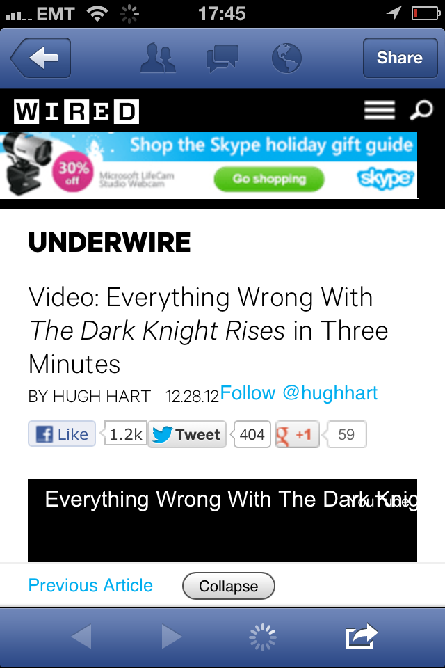
I’m normally banner blind but as a former Skype employee this one caught my attention.
You can just make out that it’s Skype, webcam and (probably) shopping. Fuzzy as belly button fluff with no less than 5 competing visual elements – the webcam, discount button, the main headline, Skype logo and green call to action button.
As a friend and mobile/web developer friend put it: “2x upscaling never works”.
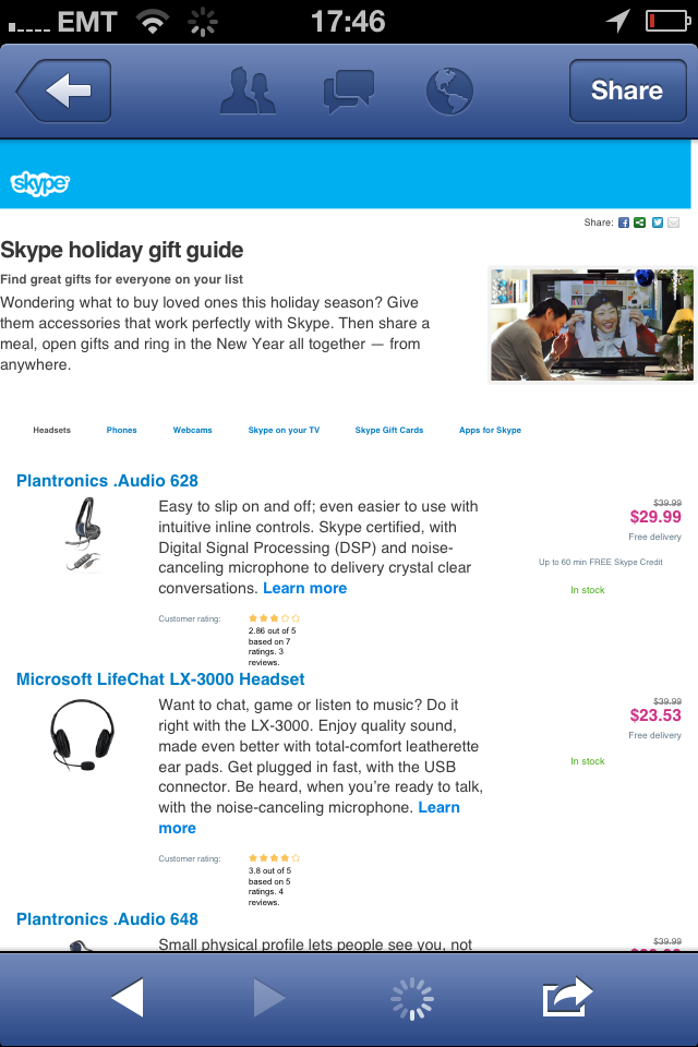
The banner links through to Skype’s holiday gift guide – yes, a full-blown web page, no mobile optimized version for you, ma’am. I wasn’t feeling masochistic enough to try the shopping experience but wouldn’t expect a mobile-friendly experience.
All this reminds me of those annoying banner ads back in 2000 that promised something good and then linked to the site homepage that had no mention of said promotion. Or maybe you got to a proper landing page but it was impossible to purchase whatever was being advertised.
I bet the conversion from ad viewer to someone who taps on the banner to someone who takes desired action is equally bad or even worse on a mobile device.
How to make it better?
Get the basics right and you’re much closer to seeing some return of investment on your ad dollars.
- Creative and design – you have very little real estate, distill the message and visuals down to the minimum. Learn from Apple – simplicity and clarity wins.
- Design and serve – don’t serve default resolution image to retina devices. It’ll look ugly as above and you’ll see lower click throughs and waste money. If the ad network you’re using doesn’t support serving different ads based on user device then don’t use them. Alternatively don’t use them for retina device visitors.
- Device specific experience – don’t send mobile visitors to your main website. Smartphones are capable enough in displaying your site but this does not mean that it’s good enough. Build a simple mobile-friendly page and tailor the shopping experience well. It’s an investment in the beginning but if you don’t do this then you’re just wasting money on ad dollars.
Not exactly rocket science. All the more puzzling that big companies like Skype still get it wrong. The smart guys are ignoring the banner ads anyway and are building creative, engaging content-based marketing campaigns.
Pingback: Annoying mini-banner ads - there's no escape